
Appearance & settings
Perch has built-in dark and light themes and a designer for making your own. Every other option lives in one Settings window, which you can search by name.
Open Settings
Section titled “Open Settings”Left-click the tray icon, or right-click it and choose Settings…. The window opens on the Features page. Press Ctrl+F anywhere in it to jump to Search.
Choose a theme
Section titled “Choose a theme”Go to Settings → Appearance. Each theme is a card with its name, a Dark or Light tag and a strip of swatches. Click a card to switch: the whole app recolours at once, including the overlay and every open window.
The built-in themes are:
- Midnight (the default)
- Ember
- Blush
- Dim
- High Contrast
- Winamp
- Daylight (light)
There are also imported palettes in both a dark and a light version, such as Nord (Dark) and Nord (Light). They include Nord, Gruvbox, Solarized, One, Tokyo Night, Rosé Pine and Sepia.
Every built-in theme is checked against WCAG AA contrast. The status colours (running, waiting, error and so on) are tuned to stay easy to tell apart in every theme.
Design your own theme
Section titled “Design your own theme”Click + Design a new theme… on the Appearance page. The designer starts from your current theme and applies every change live across the app as you edit.
- Start from: pick any built-in or imported theme as the base.
- Name: what the theme is called in the list.
- Chrome tint (hue and strength): re-tints the window and overlay surfaces in one go.
- Accent colour: links, highlights and selected controls.
- Status glyphs: recolour any of the overlay’s status colours, such as Running, Awaiting, Error, Sub-agent or Burn rate.
The Contrast (WCAG) readout checks text and glyph pairs as you go. Text needs AA contrast and glyphs need 3:1 against the overlay. A failing pair shows FAIL with a Fix button that adjusts the colour until it passes.
Click Save theme to add it to your list, or Cancel to put your previous theme back. A saved custom theme has Edit and Delete buttons beside its card.
Colour-blind preview
Section titled “Colour-blind preview”The designer’s Colour-blind preview buttons (Normal, Protan, Deutan, Tritan) simulate protanopia, deuteranopia and tritanopia on the live preview. Use them to check the status colours stay distinguishable. Only the preview is simulated: the saved theme and the contrast readout use the real colours.
Share a theme
Section titled “Share a theme”Themes travel as a short text code.
- Copy active as code copies the current theme to the clipboard.
- Import from clipboard reads a code from the clipboard, adds it to your custom themes and switches to it. Anything that is not a Perch theme code is ignored.
Find a setting
Section titled “Find a setting”Search filters every setting by name and keyword. Try words like “chime”, “cost”, “git” or “cpu”. Leave it blank to browse the full list. Toggles can be switched straight from the results.
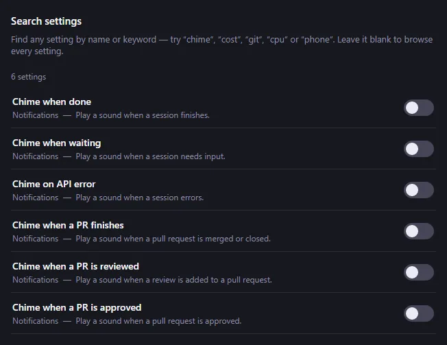
Setting names in these docs match the names in Settings, so you can paste one into Search to find it.
Browse features by surface
Section titled “Browse features by surface”The Features page shows every setting as a card, grouped by where it appears:
- Session row
- Usage bars
- System & metrics
- Notifications
- Tray & stats
- Whimsy
- Integrations
- Social
- Advanced
Use Filter features… or the surface chips to narrow the list. Toggles and number settings can be changed on the card, and take effect straight away.
A few settings only work on some systems and are hidden where they can’t work. For example, the docked overlay mode is Windows only.
Live preview
Section titled “Live preview”The Live preview pane beside the Features and Appearance pages is a miniature copy of the overlay with sample sessions. It redraws as you change a setting or theme, so you can see the effect before you look at the real overlay.
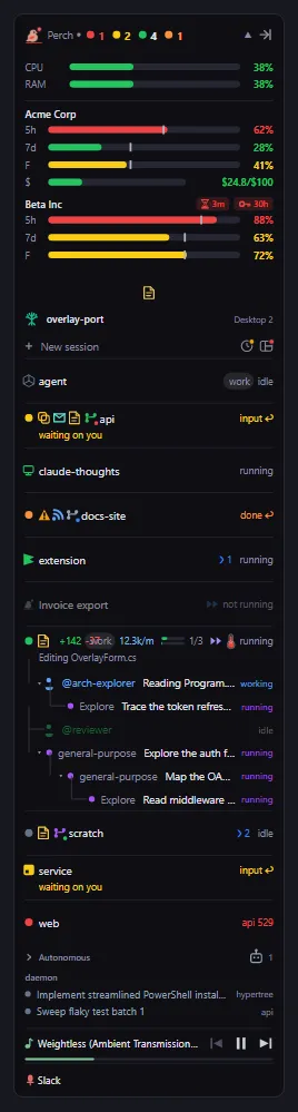
On the Features page, Rearrange under the preview lets you drag the overlay’s sections into a new order. See Overlay panel.
Other Settings pages
Section titled “Other Settings pages”Some options have their own page because they need more than a switch: Getting started, Session Stats, Achievements, Notifications, Social, Shortcuts, Quick Links, Feeds, Config directories, Export, About and Changelog.
Quiet mode
Section titled “Quiet mode”Quiet mode temporarily turns off Perch’s playful extras without changing your settings. See Alerts.
Settings
Section titled “Settings”| Setting | What it does |
|---|---|
| Theme | The app’s colour theme. Pick a preset or design your own on the Appearance page. |